Wheeldon, Johannes; Harris, Danielle --- "Expanding Visual Criminology: Definitions, Data and Dissemination" [2015] CICrimJust 18; (2015) 27(2) Current Issues in Criminal Justice 141
Expanding Visual Criminology: Definitions, Data and Dissemination
Johannes Wheeldon[*] and Danielle Harris[†]
Abstract
There is increasing interest in the use of visual tools and techniques in criminology. Many efforts are based on cultural and critical assumptions and focus on the spectacle of images. However, visual criminology may offer a wider variety of options to produce, frame and disseminate large amounts of information in more accessible ways. Of specific interest in this article is the potential for visual criminology to better present complex research findings. To this end, we discuss visual criminological efforts that have been used to engage audiences through social media. We replicate and consider key info-graphics on issues such as mass incarceration, ‘stop and frisk’, and police killings. Finally, we consider some potential problems for those interested in expanding visual approaches in criminology, and present six general propositions to be tested and further explored.
Keywords: visual criminology – presentation – interrogation –
data collection – social media – info-graphics
Introduction
Interest in visual tools and techniques is growing in many disciplines (Umoquit, Tso, Burchett and Dobrow 2012), but emergent scholarship in criminology suggests a dichotomy in the perception of their value and use. Some efforts to explore the visual turn in criminology have focused on the spectacle of images through topics such as media and crime (Greer 2009). Documentary photography, for example, has been used to present and explore the aesthetics, ethics and responsibility associated with visual representations of harm, suffering and violence (Carrabine 2012). Building on Carrabine’s (2012:463) focus on the ‘distinctive ethical questions posed by these visual representations’, Michele Brown (2014) explored visual struggles associated with mass incarceration and the use of images and new media by current and former prisoners, community members, artists and scholars.
Other efforts have been more mathematically inclined. Work path analysis (Duncan 1966), structural equation modelling (Bollen 1989) and directed acyclic graphs (Pearl 2000) have informed Robert Sampson and his colleagues’ presentation of policy graphs. As visual depictions of systems of causal relationships, policy graphs can specify the theoretical structure of a problem, and illustrate the interdependencies in causal systems. They could translate findings that assess policy interventions in explicit and concrete ways (Sampson et al 2013). To advance policy translation, policy graphs have the potential to integrate the theoretical and policy arms of criminology. While their ultimate value has yet to be determined, they are one of a number of new and innovative visual tools and techniques in criminology.
In this article we argue that criminologists should expand on previous efforts to make better and more nuanced use of visual tools and techniques for the collection, presentation and interrogation of data on crime, social control and public policy. This is more likely to occur if past approaches are presented alongside more recent visual examples and build on integrative efforts that acknowledge criminology’s interdisciplinary character (Agnew 2011). This involves expanding both how to think about depictions of crime and social control and how we define visual criminology. We argue that visual approaches provide a basis for data collection through expanded uses of concept maps, mind maps and other diagrammatic approaches (Wheeldon 2010, 2013), and new approaches to describe data, tell stories and present information (Harris 2013; Maltz 2009; Sampson et al 2013).
We build on previous work (Wheeldon and Harris 2013) and that of other criminologists (Burruss 2011; Carrabine 2008; Heidt 2008; Lippens 2004; Maltz 2009; Sampson et al 2013), detailing existing efforts to apply visual approaches to criminology based on the themes of presentation, interrogation and data collection. Based on these themes, we develop an inclusive yet provisional definition of ‘visual criminology’ based on past efforts. Finally, we discuss some specific criminological examples that present complex research findings and can be used to engage audiences through social media, such as police killings, ‘stop and frisk’ and mass incarceration.
To conclude, we outline a longer-term research agenda and consider some potential problems for those interested in expanding visual approaches in criminology. Our hope is that other researchers will test the value of the approaches we outline, and experiment with others. By building a multi-method evidence base, the rise of visual approaches in criminology can be compiled, assessed and, if warranted, sustained.
Understanding previous efforts: presentation, interrogation and data collection
Previous interest in the role of visual images in criminology borrowed from visual sociology (Becker 1974). One way to understand emergent visual methods in criminology is based on the structural composition with regards to visual modes of representation (Banks 2001). This visual–verbal spectrum is a useful framework for defining and distinguishing different categories of graphic communication. Purely verbal approaches, such as text and speech, are at one end of the spectrum (right), while more open-ended forms, such as visual images, are at the other end (left). By focusing on graphic communication like drawings, diagrams, tables and lists, Figure 1 offers one way to visualise this approach (Varga-Atkins and O’Brien 2009).
Diagrams
Drawings
Tables and
lists
Linear
flow
(verbal)
Open-
endedness
(visual)
Figure 1: The spectrum of graphic communication (Umoquit et al 2013:4)
Although distinguishing categories of graphic communication in this way may be useful, how these tools are used is also relevant. Past visual approaches to criminology can be divided into three broad categories: presenting data and findings; interrogating images of social control; and collecting visual data. Although differences between and among these approaches exist, a good starting place is the idea that the bulk of what people do is an attempt to derive meaning through the recognition of patterns (Miles and Huberman 1994). The graphic representation of knowledge can be especially useful to illuminate the process of meaning-making.
Presenting data and findings
Historically, visual techniques were principally used to engage in information or data visualisation as part of the presentation of data and findings (Funkhouser 1937; Tukey 1977). Basic pie charts, bar charts, trellis plots and network graphs have long been used as ways to visualise part of the process of scientific reasoning and to present findings. Edward Tufte (2001) is a leading expert on the visual display of quantitative information who argues that graphics play an important role in the understanding and interpretation of statistical findings. In the most recent addition of his most well-known text he writes: ‘What is to be sought in designs for the display of information is the clear portrayal of complexity. Not the complication of the simple; rather the task of the designer is to give visual access to the subtle and difficult — that is, the revelation of the complex’ (Tufte 2001:191).
Today the availability of online data sources, such as Many Eyes, Phrase Nets and Wordle (Viégas et al 2007; van Ham 2009; Viégas et al 2009), allows users to upload data and create their own visualisations easily and at little-to-no cost. The benefit of these applications is that they allow data to tell its own story and they serve as a useful first step in other more elaborate analysis (Maltz 2010). This may include the detection of outliers that might be due to human error during data entry or indicative of exceptional cases that warrant further examination (Francis and Pritchard 1998; Maltz 2010). By building a specific visual step into data analysis, patterns or relationships in the data may emerge that can characterise groups of individuals, generate possible hypotheses and inform subsequent analysis (Maltz 1998).
Visualising data has been used in a number of contexts. One way is simply as a first step in the analytic process to understand the data that have been gathered (Gelman 2004). As Maltz argues, ‘plotting data in different ways permits the analyst to obtain information from the dataset that would normally not be possible using standard (nonvisual) social science methods’ (2010:28). These complex patterns might end up being concealed simply as a consequence of the very analytical tools and processes that criminologists typically use (Maltz and Mullany 2000). Although data visualisation has thrived in many areas of social inquiry, criminology has been comparatively slow to adopt these techniques. There are a number of recent examples from criminal justice that increase efforts to visualise crime patterns and assess criminal justice responses (Sampson et al 2013).
Interrogating images of social control
Visual criminology at present is most often associated with scholarship around the power of images to shape public opinion. It has centred on the examination and interrogation of images of crime, harm and punishment focused on the power of graphic manifestation (Lippens 2012). While the study of visual aspects of law and legal practice has been established within legal studies and the sociology of law (Douzinas and Nead 1999; Lippens 2004), criminology tends to focus on the spectacle of images through topics such as ‘media and crime’ (Carrabine 2008; Greer 2009; Jewkes 2004). More recent efforts build on past analysis of how images express or help generate and/or consolidate the emergence of normative and fault lines. By demystifying and contesting the practices that underpin those lines or that make use of those images, visual representations of power, deviance and order form part of this broader program (Tester 2001).
Contesting visual presentations of social control extends from the study of images, and what they tell us, to how the creative process informs intersections between individuals, structures and forms of governance. This includes important work about the power of documentary photography in prisons and the moral implications of mediated representations of suffering within the justice system (Carrabine 2012). John Grady (2007:63–71) provides a useful overview: first, he proposes that images are iconic constructions, created by someone for some purpose, at a particular point in time. Second, images contain both behavioural and symbolic information. That is, while everyone may ‘see’ images in different ways, they serve an objective purpose of representing a concrete product or moment in time. Finally, images are part of communication strategies. Images tell stories, convey information and serve rhetorical functions.
For some, visual criminology cannot be disentangled from critical explorations of how images and law and social control inform cultural criminology (Hayward and Presdee 2010; Sherwin and Wagner 2013). We argue that it should not be limited in this way. Instead, a broader definition allows for more detailed examinations of the ways visual efforts are similar or different, successful or confusing.
Collecting visual data
An underutilised application of visual approaches in criminology involves data collection. This is based in part on an imperative to develop models of knowledge that capture data that is freely ‘given’ by participants (Drucker 2009). It might also be connected to broader trends away from the traditional positivistic practices of researcher-led data collection, and toward more subjective explorations of phenomena including how creative explorations spark new ways to interrogate meaning (Lippens and Hardie-Bick 2013). One effort has focused on the use of maps and diagrams (Novak and Gowin 1984). Criminological examples have been included as part of more general efforts to further the use of visual methods in the social sciences (Wheeldon and Ahlberg 2012). These include using concept maps to teach criminological theory (Burruss 2009; Heidt and Wheeldon 2015) and mind maps to explore values and ethics among students before and after a criminal justice internship (Wheeldon 2013).
Collecting visual data is not limited to diagrams. These approaches can assist researchers to arrange data analysed quantitatively and qualitatively, transparently outline specific analysis strategies, and present research data. It may also be of value to those working in the field including probation officers, correctional educators, counsellors and others (Wheeldon et al 2013). Allowing multiple aspects of an individual’s life to be instantly observed in a single graphic provides a visual summary of that life which can serve as a practical tool for practitioners labouring under ever-increasing caseloads. A novel method presents a graphic approach to understanding the important events that take place in an individual’s criminal and personal history (Harris 2013). These visual techniques can help people ‘see’ and thus better ‘grasp’ difficult connections and relationships in criminological theory, research and practice.
Visual criminology: A provisional definition and key categories
We define ‘visual criminology’ as the use of any image (including, but not limited, to paintings, photographs, drawings, maps, diagrams, graphs, charts and other visual/graphic approaches) to: collect information from participants; describe, present and analyse data; and/or examine or interrogate the meaning(s) of those data. Based on criminology’s interdisciplinary nature, this definition is intentionally broad. In this section we offer some practical examples of each approach based on three broad categories: collecting data, analysing data, and presenting data.
Collecting data from participants
The idea that visual maps can be used as social science data has been explored in a number of contexts (Wheeldon and Ahlberg 2012). Grady (2008) suggests that visual data can be understood as any visual object produced by people that records human doings of one kind or another. This approach to subject-generated imagery (Chalfen 1997:290) allows subjects to play a central role in data generation. Examples include asking participants to draw or map an event, experience or idea, or reviewing existing drawings, images and diagrams. An example of this might be visual ethnographies, in which photographs are used to help situate readers/viewers in the lives of those being described. These include studies of neighbourhoods in transition (Suchar 1993), the homeless (Harper 1982; Southard 1997), farm families (Schwartz 1992), and the flow of commodities in a globalising economy (Barndt 2002). Discussing photographs and other images with a subject elicits invaluable information that might not otherwise emerge through traditional data collection (Wheeldon and Faubert 2009).
For example, photo-elicitation involves collecting data using photographs produced by either the researcher or by others, including the subject. The specific line of questioning may vary, but is designed to allow the image to jog a participant’s memory or to explore the meaning the participant assigns to the image (Harper 2002). One project used such an approach to explore how a group of working-class women from Belfast, Northern Ireland, experience the place(s) in which they live (McIntyre 2003). These visual approaches provide a way to understand in a tangible sense how participants view a particular topic, and the nature of the connections between relevant issues, ideas and concepts. It also allows researchers to ‘see’ these connections and consider what the organisation of these concepts means, and to assess the hierarchical and multidimensional levels of different sorts of relationships. Researchers have examined drawings by children (Coles 1992), photographs taken by participants (Ewalt 1985), and maps created by new probation officers in Latvia about the role of law in society (Wheeldon and Ahlberg 2012) to better assess meaning.
Perhaps the most commonly employed example of visual data collection tools are concept maps (Novak and Gowin 1984) and mind maps (Buzan 1974). Traditionally used in science education (Stewart et al 1979), concept maps are organised hierarchically with the most important terms on the top and less important terms underneath. Most authors who work with concept maps require that maps include linked concepts that form clear propositions or meaningful phrases. This often necessitates some training by researchers to ensure that participants understand how to construct them (Novak and Cañas 2008). By contrast, mind maps have the potential to be far more creative. They are often less formal, do not require linking phrases, and generally focus on one topic at a time. They may use colour, graphics, bold lines or other techniques in the creation of a very personal map that reflects the author’s individual views (Buzan and Buzan 2000). Mind maps often begin in the centre of the page with central ideas or themes and radiate out. Their free-form possibilities are of interest to qualitative researchers seeking new kinds of data collection tools.
One way to differentiate concept maps and mind maps is to consider the research methods employed by researchers who use them. One important distinction relates to quantitative and qualitative research approaches. While qualitative researchers have explored the use of concept maps to clarify relationships identified through interviews (Raymond 1997), they have been most widely used in quantitative research. Other differences are also relevant when considering their use to collect social science data. Concept maps typically require strict construction criteria and a uniform structure perhaps more in line with the quantitative focus on objective measurements and generalisability. Given their typically free-form nature, mind maps may align more with the qualitative focus on capturing unique, individual perceptions, reflections or experiences (Wheeldon and Faubert 2009). In general, it is useful to apply different visual techniques and approaches based on the research question of interest (Maltz 2010). Figure 2 provides an overview.
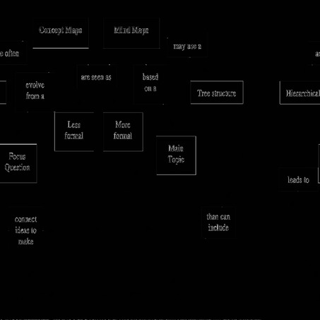
Figure 2: Concept maps and mind maps (Wheeldon and Ahlberg 2012:30)
As Figure 2 demonstrates, maps come in a variety of formats. An example of a visual map of specific relevance to criminologists is the Life History Calendar (Laub and Sampson 2003). Life History Calendars allow for the time (year), length and frequency of major life events to be plotted by age. These life events usually include arrests, convictions, residences, housemates, family, marriage, children, employment, military, and custody. Data are drawn from a variety of sources: archival data including court reports; criminal records; police reports; school and employment records; correspondence sent and received during treatment; psychological reports; clinical assessments; and interviewer notes. In an elaboration of Life History Calendars, Harris (2013) developed the Life History Plot. These plots allow researchers and practitioners to combine different characteristics of individuals, such as number of criminal charges, age of official criminal onset, and criminal career length with life course-relevant details such as military involvement, marriage, parenthood, and foster care.
An example of a Life History Plot and brief description is provided in Figure 3.
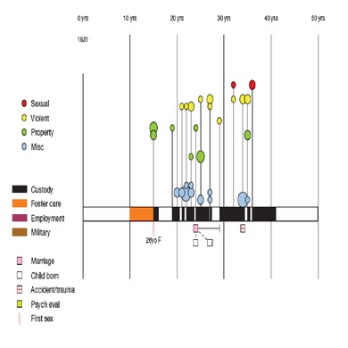
Figure 3: Life history plot case A (Harris 2013:102)
Case A was born in 1931 and was referred for civil commitment while serving a custodial sentence for two incidents of sexual assault that occurred when he was
36 years old. The Life History Plot shows that he lived in foster care for five years, from ages 10 to 15. His first officially recorded offence at age 15 included several property crimes for which he served one year in juvenile detention. His first sexual experience occurred the same year, with a 26-year-old woman. He reoffended at 19 with another property offence and again received a custodial sentence. He spent much of the next 20 years in custody, and was immediately reincarcerated upon release. His criminal career was marked by a versatile array of property, miscellaneous and violent offences, including acts of violence and property damage committed while in custody.
To make a plot, first a central timeline is created to indicate time. Shading along this line illustrates whether the individual was in foster care (mid-grey shading), in custody (black shading), in the military (light grey shading), or gainfully employed (dark grey shading). Second, the units of analysis along this line are years and they are marked at ten-year divisions. Time when the line is not shaded (white) indicates unemployed, non-offending street time. Third, a grey shaded bar directly above the central timeline indicates periods of self-reported substance abuse. Finally, the icons under the central timeline specify important events including (in ascending order from the bottom of the plot): first sexual experience (with age and gender of partner noted); inpatient psychiatric evaluations; and serious accidents or trauma (such as head injuries/concussions or broken bones). Marriages are shown just below the central timeline by a rectangular box (indicating the length of the relationship) and a line and boxes stemming from it indicate children born of that marriage. The official criminal record is featured above the central timeline.
To represent criminal offences, each stem represents one year and each circle on a stem indicates an officially recorded offence. The height of the circle denotes the seriousness of the offence and the area of the circle is proportional to the number of charges for that offence in that year. Crimes are arranged into four offence categories (in order of increasing seriousness): miscellaneous, property, nonsexual violence, and sexual offences (Harris 2008).
The value of the Life History Plot is threefold. First, it can uncover key differences between individuals, all of whom would be simply coded as a ‘sex offender’ in existing data sets. This allows for better and more nuanced questions based on the nature, type and history of offenders. Second, visualising key life events and criminal convictions allows the theoretical constructs identified in life course criminology to become apparent even to non-specialists. Key events jump off the page and visually connect theory and individual experiences in novel ways. Finally, for those who work with these individuals, a quick visual map of each individual in their case load allows them a quick means of recall and ability to note similarities and key differences among offenders involved in custodial treatment programs or additional programming provided in the community.
Another elaboration of Life History Calendars has been developed by practitioners in Washington State as part of their correctional education programming. In partnership with the Department of Corrections, Walla Walla Community College and Washington State University, students enrolled in General Equivalency Diploma (‘GED’) programming are encouraged to create visual maps of their personal education and learning experiences to date. These maps can assist instructors to understand the successes and challenges that incarcerated students have faced in the past. They have been used as a central part of a participatory process whereby students and instructors work together to develop educational plans to identify past challenges and promote GED program buy-in (Wheeldon et al 2013). Figure 4 provides an example.
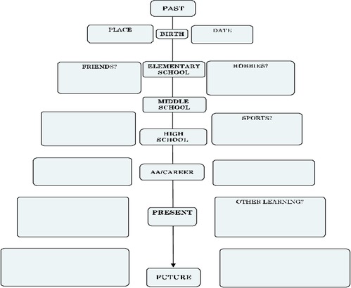
Figure 4: Mapping education and learning history (Wheeldon et al 2013:68)
Mapping crimes/Engaging audiences
As Figure 4 demonstrates, engaging the subject (and, in this case, allowing for the student and instructor to participate simultaneously) is an important advantage of the visualisation process. These sorts of interactions may also be relevant within the data themselves. For example, visualising datasets has become far simpler with the development of tools provided through a free online service called ManyEyes (Viegas and Wattenberg 2009). Users may visualise existing data provided through the website or they can upload their own data. The resource allows users to see relationships among data points using scatter plots, matrix charts and network diagrams, and to compare a set of values through bar charts, block histograms and bubble charts. In addition, users can track rises and falls over time using line graphs and stack graphs, and see parts of a whole using pie charts and tree diagrams.
Another example of mapping is crime mapping or geo-coding, which assesses the spatial association between pairs of events or incidents, and makes GPS monitoring possible to track the movement of suspicious vehicles or individuals on community supervision. It has also led to the rise in Hot Spot research. This technique was recently employed in a study of the ‘near repeat’ phenomenon, testing whether certain areas that have experienced a particular crime are at a greater risk of repeat victimisation (Youstin et al 2011). Another set of popular approaches is the use of geographical information systems (‘GIS’) analysis to engage in crime mapping and spatial analysis (Youstin, Nobles, Ward and Cook 2011). GIS analysis captures and organises information within the context of geography and has been used for an array of purposes, including examining ‘human behaviors that can be measured by or influenced by distance’ (Batsche and Reader 2012:26). Recent studies have explored spatiotemporal patterns of terrorist incidents (Medina, Siebeneck and Hepner 2011), and the intersection of affordable housing and proximity to certain social services, and have identified areas of crime and associated challenges for individuals transitioning from foster care to independent living (Batsche and Reader 2012).
Although these tools are valuable, a challenge for anyone engaging in visualisation is that turning a dataset from raw material into an accurate graphic representation is not simple; nor does it follow a single-track, linear path (Maltz 2010). Instead, the process is one of near constant iteration and is subject to the same sorts of errors as other analysis. However, the development of different designs, tweaking, and evaluating each design’s strengths and weaknesses is often obscured in the final product. This hampers conceptual clarity, methodological understanding and efforts at replication. Visually cataloguing is one analytic inference process can assist and concept and mind maps themselves can play an essential process in transparently outlining the various stages of analysis (Wheeldon 2010). It can also be a powerful means to engage audiences.
A recent example along these lines suggests the interconnections between visual technologies and graphical efforts in criminology. Consider interactions between communities and police in the United States (‘US’). While the use of video is certainly not new, the ubiquity of mobile phones makes recording these interactions simple. Projects like FilmingCops.com are attempts to document police abuses, as is a new ACLU Cellphone application that automatically preserves video of police encounters. If the application is downloaded to your phone, for example, even if the police seize the phone and destroy it, the video will be saved.
Citizen-driven efforts can also make use of official reports from traditional media; for instance, based on data collected from corporate news reports of people killed by US law enforcement officers since 1 May 2013. While the data collected at KilledByPolice.net are based on news reports, they do not distinguish between justified and unjustified killings. Nevertheless, the resulting visual imagery (presented in Figure 5) is stark.
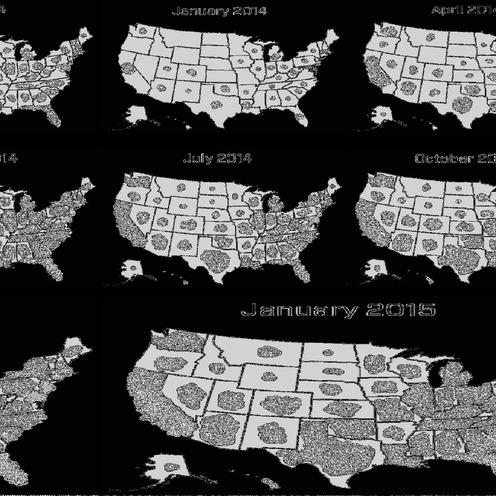
Figure 5: A year of killings by police in the US (Evers and Vocativ 2015)
Although representing data in this way is extremely powerful, mapping is more than the geographic presentation of data. It may facilitate the teaching of complex (and sometimes dry) subject matter, such as methods and theory. One recent text examines criminological theory through a seven-step process (Heidt and Wheeldon 2015). By tracing the development of theories, key concepts and propositions, it uses concept and mind maps to help students understand key criminological theories, the relevant social context in which they were developed, the assumptions about human nature they make, and concepts, scope, and level of explanation each presents. In addition, the role of research in terms of testing theories and applying them within the criminal justice system is examined. Using visual approaches to highlight different research examples and explain how and why the research advances or complicates these theories has been shown to assist students to learn. By organising theory based on discrete conceptual steps, students can visualise how these steps are connected.
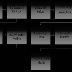
Figure 6: Seven steps to criminological thinking (Heidt and Wheeldon 2015:8)
Describing images and presenting findings
Efforts to reframe visual criminology would not be complete without recognition of the work of many criminologists who have problematised the power and production of images of crime and social control (Lippens 2012). A seminar, ‘Visual Criminology: Crime, Criminal Justice, and the Image’,[‡] presented myriad ways visual images are implicated in considerations around criminalisation, accusation, crime, and space. Examples include the role of war photographs, the Danish cartoons of the Prophet Mohammed, and other examples drawn from the United Kingdom (‘UK’), such as the representation of geographical ‘no-go zones’ and so-called dangerous neighbourhoods, and an image of Jamie Bulger. Bulger, a two-year old boy from Kirkby, England was abducted, tortured and murdered by two ten-year-old boys in 1993. Lippens (Visual Criminology 2013–14) asks, ‘What does a CCTV picture of Jamie Bulger holding hands with his killers tell us?’
Difficult questions can force a broader reckoning of the ways in which media images of crime have made societies from the US to the UK and Canada justify more punitive approaches despite the lack of evidence showing that severe approaches to crime control make society safer. Likewise, the ways in which the media reports crime rates with little context or comparison, or suggest guilt by broadcasting images of individuals in an orange jumpsuit although they are only accused and not yet convicted, represent significant challenges to accurate reporting. For those who doubt the power of images, an internet search of ‘looters’ and ‘finders’ will bring up newspaper accounts of individuals in the aftermath of Hurricane Katrina who acquired food and supplies from flooded and abandoned stores. In one newspaper photo, a Caucasian couple is reported to have ‘found’ supplies in a local store, while in another publication a picture of African American man wading through water is described as having just ‘looted’ a local store.[§]
Another example involves an immersion into the world of homelessness, drug addiction and crime on the streets of San Francisco. For a decade, Bourgois and Schonberg (2009) collected data and combined photography and close ethnography to provide a vivid window into the lives and social network of two-dozen heroin injectors and crack smokers. Through the intersection of black-and-white photographs, vivid dialogue, detailed field notes and critical theoretical analysis, the authors provide a window into the lives of those they followed and the challenges of policing this population. The researchers documented and described how, to feed their addictions, participants generating income through burglary, panhandling, recycling, and day labour confronted the inadequacies of medical care and welfare, and engaged with law enforcement on a regular basis.
Others, such as digital artists, have begun to experiment with efforts designed to challenge pervasive myths about the criminal justice system in novel ways. One example highlights how the steady increase of individuals seeking a criminal justice-related degree over the past 30 years appears linked to the popularity of televised crime dramas.[**] A more detailed criminological example explores how ‘stop and frisk’ policies affect those who experience them at a young age. A study from Vera’s Center on Youth Justice (Fratello, Rengifo and Trone 2013) reveals low trust in law enforcement among young people who have been stopped more often under these policies; youth stopped more often are less willing to report crimes, even when they are the victims. The report features an info-graphic, reproduced in part below in Figure 7.[††]
While some of these efforts are by definition confrontational and critical, the broader observations about the power of visual representations of data and research can be applied to other efforts to present information to those working within the criminal justice system. This might be connected to interest in translational criminology, in which the disconnect between rigorous research and the needs of those implementing justice policies on the ground has been identified as a significant impediment to evidence-based policy making (Sampson et al 2013:1). Policy graphs have been presented as conceptual tools for advancing the goal of policy translation by graphically presenting the theoretical structure of a problem, illustrating the interdependencies in a causal system, and translating findings that assess policy interventions in an explicit and concrete way.

Figure 7: The social consequences of ‘stop and frisk’ for youth in New York City (Fratello, Rengifo and Trone 2013)
Efforts to streamline research for policymakers, as above, would be an improvement over the provision of long, complex data tables, and the problematic assumption that readers can make sense of the complex analysis provided. Consider a recent report issued by the National Academy of Sciences (Travis, Western and Redburn 2014), catalogued in a 400-plus page report, which reviewed evidence of the effects of high rates of incarceration on public safety as well as those in prison, their families, and the communities from which these men and women originate and to which they return. The info-graphic in Figure 8 summarises some of the key findings.
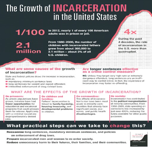
Figure 8: The growth of incarceration in the US (NAS 2014)
Discussion, limitations and testable propositions
Our argument is based on two central assumptions. The first is that visualisation will play an increasingly important role in the social sciences generally, and in criminology more specifically. From data visualisation to info-graphics, the ubiquity of computing power already allows this to occur. As people increasingly engage visually with phones, tablets, computers and various forms of entertainment and social media, expectations about (and potential for) visual techniques are likely to grow. The second assumption is that the promise associated with visual approaches to criminology must be assessed empirically. Although rigorous testing is beyond the purview of this article, we provide and situate some contemporary criminological examples.
However, all methods and approaches to capture meaning and promote understanding are limited in one way or another. While we have outlined the benefits of increased use of visual methods in criminology, these benefits may be complicated by a number of factors. These can limit their value to collect information from participants, present understanding, analysis, and data, as well as interrogate the meaning(s) associated with law, deviance and order. Despite the interest in new visual approaches, not everyone is able to communicate or engage visually. Some work has suggested resistance among participants to the use of visual maps in data collection (Wheeldon and Faubert 2009). Others continue to maintain that participants must be taught to make ‘correct’ maps (Novak and Canas 2008), perhaps undermining their more flexible use. While Harris (2013) offers another way to see how research-participant mapping can overcome some challenges inherent in participant-led data collection, more research is needed.
This definitional concern is also shared by those who draw a sharp distinction between data visualisation based on rigorous statistical models and info-graphics which may be exciting and/or visual appealing but not logically organised or consistently designed (Gelman 2011). The question is not which is better, but which is best suited to what sort of goal. This distinction is important for concerns related to visual data collection. Different assumptions for concept maps and mind maps require some consideration about which types of designs and research questions each is best suited to address (Wheeldon and Ahlberg 2012).
Another challenge involves using visual maps to engage in data analysis. On one view, ‘looking at the data’ first is cheating, and can amount to a fishing expedition, turning traditional quantitative hypothesis testing based on predefined predictor and outcome variables on its head (Maltz 2010). Likewise, by using visuals in qualitative analysis, the patient art of inductive pattern-seeking may be sidelined by simplistic approaches that replace in-depth exploration with approaches that favour visual shorthand and graphically appealing representations (Harris 2013).
It is possible that just as visual data analysis leads to oversimplification, so too do visual presentations of data in which contested, complex or otherwise limited findings are ignored in the interests of accessibility. These critiques should be considered alongside findings that university students today are expected to read and write less as part of their coursework. Even proponents must contend with the very real worry that embracing visual methods may further erode other means of communication. Though it would be a shame, our call for more visuals may provide an excuse to avoid dense texts and embrace the ‘magazine effect’ whereby criminology is presented via glossy, provocative pictures of ‘perps’ with pixelated faces, handcuffs, line-ups and crime scene tape.
Most promising perhaps is the ability for these images to be widely shared among social networks and more traditional media. KilledbyPolice.net has nearly 30 000 likes on Facebook. Since August 2015, the data it has collected has been cited in more than 100 newspaper articles. The report by VERA on ‘stop and frisk’ was cited by CBS news and informed New York State Attorney General Eric T Schneiderman’s (2013) analysis. That analysis and losses in the Federal Court led the city to drop its appeal and begin a joint remedial process. Of specific interest is that, while the technical report on this research was downloaded 630 times since its release, to date the info-graphic has been downloaded nearly four times as often — a total of over 2400 downloads. This makes VERA’s ‘stop and frisk’ info-graphic the most popular way for those interested to access the information provided in the report (Mehler 2015).
Of course, the popularity of an approach, or the ease of its transmission, is not indicative of its policy relevance. More study is needed to understand how and why different images can better define, confuse and/or engage audiences. To guide future efforts at visual criminology, six propositions can be tested to encourage the next generation of researchers to think through the potential of and problems in exploring visual criminology in definitional, operational, and administrative terms. Some initial propositions are listed in Table 1.
Table 1: Visual criminology: defining testable propositions
|
Category
|
Testable proposition
|
|
Collection of data
|
Visual data collection can overcome: 1) language barriers;
2) terminological differences; 3) limitations of researcher-led
research
|
|
Visual maps: 1) are as good as other forms of participant-led data
collection techniques; 2) yield data that participants recognise
as valuable (in
terms of depth/detail/difference)
|
|
|
Analysis of data
|
Preliminary analysis using visualisation can enable the identification of
outliers that might warrant exclusion or further study
|
|
Visual tools can aid researchers and readers to: 1) understand assumptions;
2) present/follow analysis strategies; 3) justify research
decisions as part of
inferential/analytical frameworks
|
|
|
Presentation of data
|
Visual approaches can be shared more easily via social networks and
challenge pervasive myths about the justice system better than
other
approaches
|
|
Visual maps can enhance understanding of research findings among
practitioners and the public when compared to other text- or table-based
approaches
|
Conclusion
The use of visual tools and techniques in criminology is not new. However, criminologists could make better and more nuanced use of visual techniques for the collection, presentation, and interrogation of data on crime, justice policies and perceptions of social control. Based on previous and emergent work, we have detailed existing efforts to apply visual approaches to criminology through the prism of data collection, data analysis and data presentation. By providing a provisional definition, cataloguing the variety of uses employed to date and sharing specific visual examples used in criminology, we have offered a unique window into the potential and problems for new approaches to visual criminology. There may be practical benefits associated with older forms of visualisation as well. By encouraging students, researchers and practitioners to engage in visualisation, the value of graphic creation, reflection and revision can be more broadly applied in a variety of settings.
As part of a longer-term research agenda, we presented six propositions to be tested in more detail. The potential for concept maps, life history plots, policy graphs, visual research summaries and other graphic approaches must be based on rigorous research, including quantitative, qualitative and mixed method designs. Such research requires an understanding of extant efforts relevant to visual criminology, a recognition of the import of definitional categories, and a commitment to continue to develop, critique, revise and adapt current approaches based on clear and testable propositions.
References
Banks M (2001) Visual Methods in Social Research, Sage
Batsche C and Reader S (2012) ‘Using GIS to Enhance Programs Serving Emancipated Youth Leaving Foster Care’, Evaluation and Program Planning 35, 25–33
Becker H (1974) ‘Photography and Sociology’, Studies in the Anthropology of Visual Communication 11(1), 1–19
Bollen KA (1989) Structural Equations with Latent Variables, Wiley
Bourgois P and Schonber J (2009) Righteous Dopefiends, University of California Press
Brown M (2014) ‘Visual Criminology and Carceral Studies: Counter-images in the Carceral Age’, Theoretical Criminology 18, 176–97
Burruss GW (2009) ‘Mapping Criminological Theory’, Journal of Criminal Justice Education 20(1), 4–19
Buzan T (1974) Use of Your Head, BBC Books
Buzan T and Buzan B (2000) The Mind Map Book, BBC Books
Carrabine E (2008) Crime, Culture and the Media, Polity Press
Carrabine E (2012) ‘Just Images: Aesthetics, Ethics and Visual Criminology’, British Journal of Criminology 52(3), 463–89
Chalfen R (1987) Snapshot Versions of Life, Bowling Green State University Popular Press
Coles R (1992) Their Eyes Meeting the World, Houghton Mifflin
Douzinas C and Nead L (eds) (1999) Law and the Image. The Authority of Art and the Aesthetics of Law, University of Chicago Press
Drucker J (2009) SpecLab: Digital Aesthetics and Speculative Computing, University of Chicago Press
Duncan OD (1966) ‘Path Analysis: Sociological Examples’, American Journal of Sociology 72, 1–16
Ewald W (1985) Portraits and Dreams, Writers and Readers
Francis B and Pritchard J (1998) ‘Bertin, Lexis and the Graphical Representation of Event Histories’, Bull Comite Francais de Cartographie 156, 80–7
Fratello F, Rengifo A and Trone J (2013) ‘Coming of Age with Stop and Frisk: Experiences,
Self-Perceptions, and Public Safety Implications’ <http://www.vera.org/sites/default/files/resources/
downloads/stop-and-frisk-summary-report-v2.pdf>
Funkhouser HG (1937) ‘Historical Development of the Graphical Representation of Statistical Data’, Osiris 3, 269–310
Gelman A (2004) ‘Exploratory Data Analysis for Complex Models’, Journal of Computational and Graphical Statistics 13(4), 755–79
Gelman A (2011) ‘“Information Visualization” vs. “Statistical Graphics”‘ <http://andrewgelman.com/
2011/07/22/information-visualization-vs-statistical-graphics/>
Grady J (1996) ‘The Scope of Visual Sociology’, Visual Sociology 11(2), 10–24
Grady J (2001) ‘Becoming a Visual Sociologist’, Sociological Imagination 38(1–2), 83–119
Grady J (2007) ‘Visual Sociology’ in Clifton D Bryant and Dennis L Peck (eds), 21st Century Sociology: A Reference Handbook, Volume 2, Sage Publications, 63–70
Greer C (ed) (2009) Crime and Media: A Reader, Routledge
Harper D (1982) Good Company, University of Chicago Press
Harper D (2002) ‘Talking about Pictures’, Visual Studies 17(1), 13–26
Harris D (2008) ‘Offense Specialization and Versatility in a Sample of Male Sexual Offenders Referred for Civil Commitment’, PhD Thesis, Griffith University
Harris D (2013) ‘Using Life History Plots to Visualize Criminal Careers’, Criminal Justice Review 38, 94–109
Hayward K and Presdee M (2010) Framing Crime: Cultural Criminology and the Image, Routledge
Heidt J (2008) The Growth of Criminological Theories, VDM Verlag
Heidt J and Wheeldon J (2015) Introducing Criminological Thinking: Maps, Theories and Understanding, Sage Publications
Jewkes Y (2004) Media and Crime, Sage
Kesby M (2000) ‘Participatory Diagramming: Deploying Qualitative Methods through an Action Research Epistemology’, Area 32(4), 423–35
Lim S (2008) ‘Transformative Aspects of Genogram Work: Perceptions and Experiences of Graduate Students in a Counselling Training Program’, The Family Journal: Counseling and Therapy for Couples and Families 16, 35–42
Lippens R (ed) (2004) Imaginary Boundaries of Justice, Hart
Lippens R and Hardie-Bick J (2013) ‘Can One Paint Criminology?’, Journal of Theoretical and Philosophical Criminology 1(1), 64–73
McGoldrick M, Gerson R and Schellenberger S (1999) Genograms: Assessment and Intervention
(2nd ed), Norton
McIntyre A (2003) ‘Through the Eyes of Women: Photovoice and Participatory Research as Tools for Reimagining Place’, Gender, Place, and Culture 10(1), 47–66
McIntyre A (2008) Participatory Action Research, Sage Publications
Maltz M (1996) ‘Criminality in Space and Time: Life Course Analysis and the Micro-ecology of Crime’, in J Eckand and D Weisburd (eds), Crime and Place, Criminal Justice Press, 315–47
Maltz M (1998) ‘Visualizing Homicide: A Research Note’, Journal of Quantitative Criminology 15, 397–410
Maltz M (2010) ‘Look before You Analyze: Visualizing Data in Criminal Justice’ in A Piquero and D Weisburd (eds), Handbook of Quantitative Criminology, Springer Science, 25–52
Maltz M and Mullany J (2000) ‘Visualizing Lives: New Pathways for Analyzing Life Course Trajectories’, Journal of Quantitative Criminology 16, 255–281
Medina R, Siebeneck L and Hepner G (2011) ‘A Geographic Information Systems (GIS) Analysis of Spatio-temporal Patterns of Terrorist Incidents in Iraq 2004–2009’, Studies in Conflict and Terrorism 34, 862–82
Miles MB and Huberman MA (1994) Qualitative Data Analysis: An Expanded Sourcebook (2nd ed), Sage
National Academies Press (2014) Infographic: The Growth of Incarceration in the United States <http://www.nap.edu/visualizations/incarceration/>
Novak JD and Cañas AJ (2008) ‘The Theory Underlying Concept Maps and How to Construct and Use Them: Technical Report’, IHMC Florida Institute for Human and Machine Cognition
Novak JD and Gowin DB (1984) Learning How to Learn, Cambridge University Press
Pearl J (2000) Causality: Models, Reasoning, and Inference, Cambridge University Press
Raymond AM (1997) ‘The Use of Concept Mapping in Qualitative Research: A Multiple Case Study in Mathematics Education’, Focus on Learning Problems in Mathematics 19(3), 1–28
Sampson R and Laub J (1993) Crime in the Making: Pathways and Turning Points through Life, Harvard University Press
Sampson RJ, Winship C and Knight C (2013) ‘Overview of: “Translating Causal Claims: Principles and Strategies for Policy-Relevant Criminology”’, Criminology and Public Policy, 12(4), 587–616
Schwartz D (1992) Waucoma Twilight, Smithsonian Institution Press
Sherwin R and Wagner A (eds) (2013) Law, Culture and Visual Studies, Springer Publications
Southard PA (1997) ‘Homeless Campers Living on Rural Public Lands’, Visual Sociology 12(2), 47–64
Stewart J, Van Kirk J, Rowell R (1979) ‘Concept Maps: A Tool for Use in Biology Teaching’,
The American Biology Teacher 41(3), 171–5
Suchar C (1993) ‘The Jordaan’, Visual Sociology 8(1), 41–51
Tester K (2001) Compassion, Morality and the Media, Open University Press
Travis J, Western B and Redburn S (2014) The Growth of Incarceration in the United States Exploring Causes and Consequences: Committee on Causes and Consequences of High Rates of Incarceration. Committee on Law and Justice Division of Behavioral and Social Sciences and Education, National Academies Press
Tufte E (2001) The Visual Display of Quantitative Information (2nd ed), Graphics Press
Tukey JW (1977) Exploratory Data Analysis, Addison-Wesley Publishing
Umoquit MJ, Tso P, Burchett H, Dobrow MJ (2011) ‘A Multidisciplinary Systematic Review of the Use of Diagrams as a Means of Collecting Data from Research Subjects: Application, Benefits and Recommendations’, BMC Medical Research Methodology 11, 1–10
Umoquit M, Tso P, Varga-Atkins T, O’Brien M and Wheeldon J (2013) ‘Diagrammatic Elicitation: Defining the Use of Diagrams in Data Collection’, The Qualitative Report 18(60), 1–12
van Ham FV, Wattenberg M, Viégas FB (2009) Mapping Text with Phrase Nets, IEEE Transactions on Visualization and Computer Graphics 15(6), 1169–76
Varga-Atkins T and O’Brien M (2009) ‘From Drawings to Diagrams: Maintaining Researcher Control During Graphic Elicitation in Qualitative Interviews’, International Journal of Research and Methods in Education 32, 53–67
Viégas FB and Wattenberg M (2009) Artistic Data Visualization: Beyond Visual Analytics, Proceedings of IEEE InfoVis
Viégas FB, Wattenberg M, van Ham F, Kriss J and McKeon M (2007) Many Eyes: A Site for Visualization at Internet Scale, Proceedings of IEEE InfoVis
Visual Criminology (2013–14) About <http://visualcriminology.com/about/>
Weiss E, Coll J, Gerbauer J, Smiley K and Carillo E (2010) ‘The Military Genogram: A Solution-focused Approach for Resiliency Building in Service Members and Their Families’, The Family Journal: Counseling and Therapy for Couples and Families 18, 395–406
Wheeldon J (2010) ‘Mapping Mixed Methods Research: Methods, Measures, and Meaning’, Journal of Mixed Methods Research 4(2), 87–102
Wheeldon J (2013) ‘To Guide or Provoke? Maps, Pedagogy, and the Value(s) of Teaching Criminal Justice Ethics’, The Journal of Criminal Justice Education 24(1), 97–121
Wheeldon J and Ahlberg M (2012) Visualizing Social Science Research: Maps, Methods, and Meaning, Sage Publications
Wheeldon J, Chavez R and Cooke J (2013) Debate and Dialogue in Correctional Settings: Maps, Models, and Materials, IDebate Press/Open Society Foundation
Wheeldon JP and Faubert J (2009) ‘Framing Experience: Concept Maps, Mind Maps, and Data Collection in Qualitative Research’, International Journal of Qualitative Methods 8(3), 68–83
Youstin T, Nobles M, Ward J and Cook C (2011) ‘Assessing the Generalizability of the Near Repeat Phenomenon’, Criminal Justice and Behavior 38, 1042–63
[*] Assistant Professor, School of Justice Studies and Sociology, Norwich University, 158 Harmon Drive, Northfield, VT 05601, USA. Email: jwheeldon@norwich.edu.
[†] Associate Professor, Department of Justice Studies, San Jose State University, 1 Washington Square, San Jose, CA 95192, USA. Email: danielle.harris@sjsu.edu.
[‡] For some background on the course and draft syllabus see Visual Criminology (2013–14).
[§] A simple Google images search will bring up these examples. Another historic, although still enduring, illustration of the way in which media images play into or perhaps reinforce stereotypes is the television program ‘COPS’, in which depictions of those in contact with the law are at odds with the Uniform Crime Reports, depicting myths as fact and portraying a biased view of gender and minorities in the criminal events recounted through the show (Munk-Turner et al 2007).
[**] This work includes the image entitled ‘Criminal Justice Degrees and the CSI Effect’ created by Aaron Scamihorn and available here: <http://visual.ly/criminal-justice-degrees-and-csi-effect> . A collection of other relevant criminological images is here: <http://pinterest.com/visualcrim/> .
[††] VERA’s infographic is available here: <http://www.vera.org/stop-and-frisk-study-infographic> .